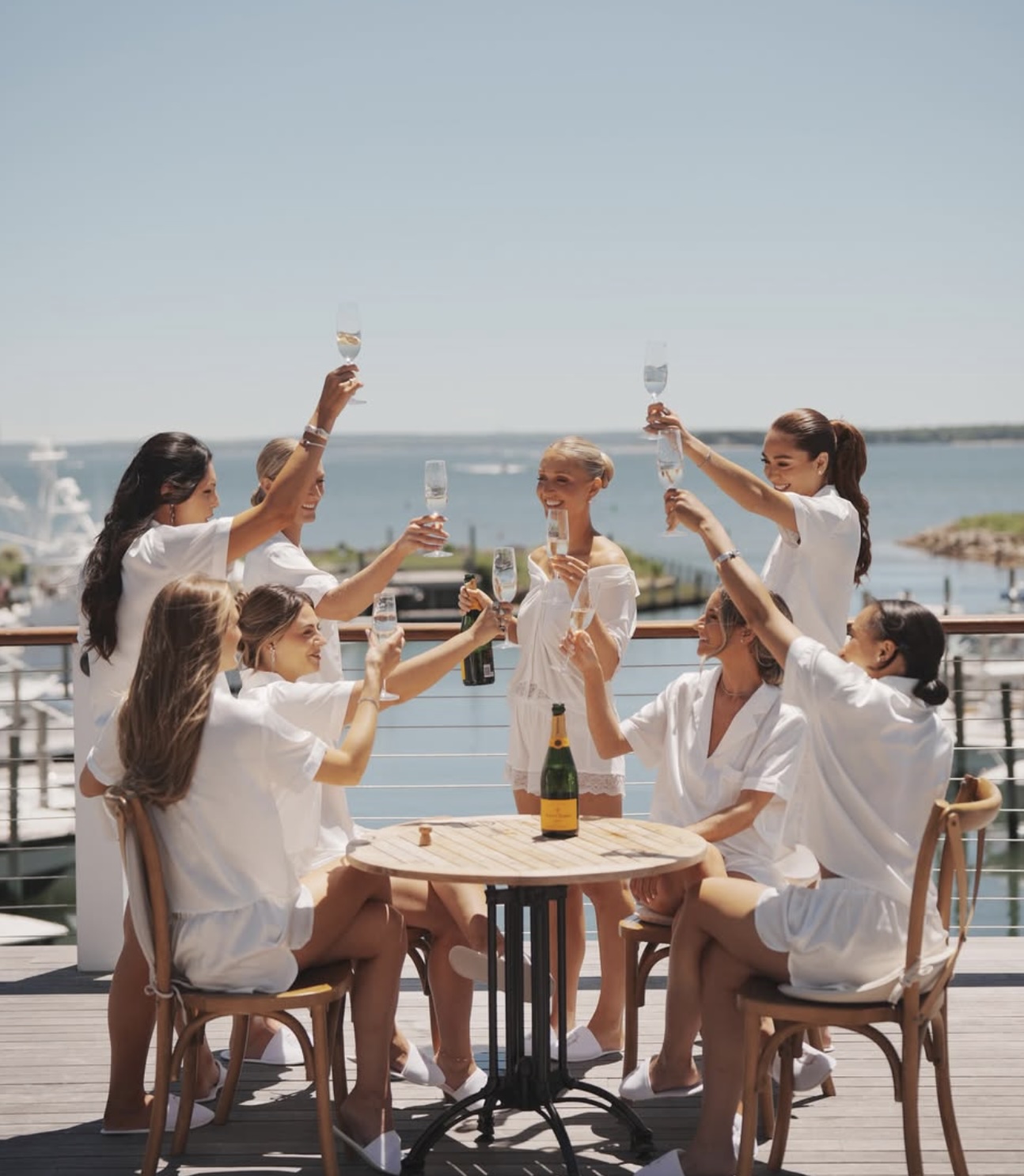

A Refined Yacht Club Wedding in Soft Greens and White
Sarah & Brian’s Celebration at Peconic Bay Yacht Club

Some venues set the tone before a single detail is designed, and Peconic Bay Yacht Club is exactly that kind of place. For Sarah & Brian’s June 2026 wedding, the waterfront setting called for a palette that felt as timeless as the view: classic greens, crisp whites, and warm taupe, carried through every piece of day-of stationery.
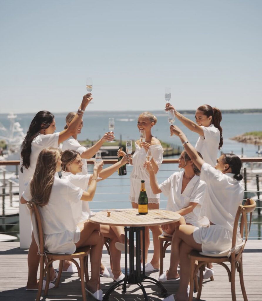
Set right on the water, the day balanced nautical ease with the kind of refined, understated elegance that never feels dated — the perfect backdrop for a coastal wedding that still reads as classic and elegant rather than beachy or casual.

The Palette

Greens, whites, and taupes are a quietly sophisticated combination for a waterfront wedding — soft enough to feel breezy near the bay, but rich enough to stay grounded and elegant rather than washed out. That balance guided every paper detail designed for the reception.
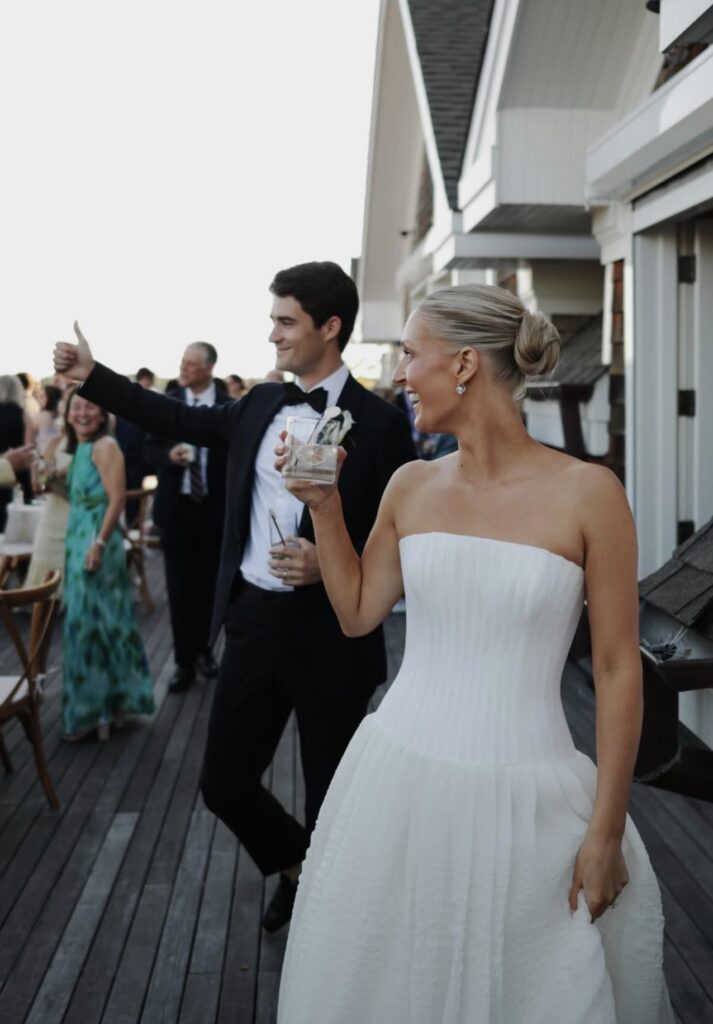
Menus
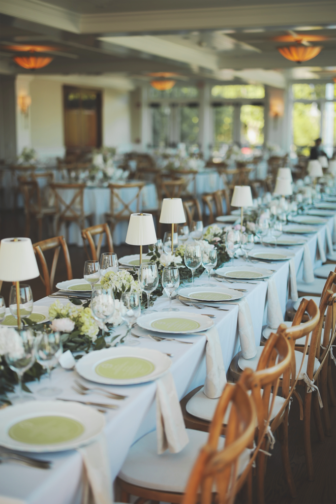
Each menu card was designed to feel like a natural extension of the day’s palette — [describe paper stock, ink colors, any motifs/monogram used] — set at each place to welcome guests to their seats with the same refined, coastal-classic feel as the rest of the room.

Vendor Credits
- Venue: Peconic Bay Yacht Club
- Photography: Studio 27 Photography
- Day-of Stationery (Menus, Table Numbers, Place Cards): Ainsley & Elaine Paper
Looking for custom day-of paper goods as refined as Sarah & Brian’s? Get in touch to start designing your own.


